Difference between revisions of "Wireframes"
m |
|||
| (One intermediate revision by the same user not shown) | |||
| Line 1: | Line 1: | ||
| + | == Introduction == | ||
| + | |||
''''Wireframes'''' is the name for a simple technique to streamline the development. The technique basically assumes that your webpages are built from rectangles (see the [http://www.w3schools.com/css/css_boxmodel.asp box model]) and it helps to create order in the development chaos by facilitating a visual approach. See also [http://en.wikipedia.org/wiki/Website_wireframe Wikipedia], review a [http://webdesign.tutsplus.com/articles/a-beginners-guide-to-wireframing--webdesign-7399 beginners guide] or view some general [http://www.gliffy.com/uses/wireframe-software/ examples] | ''''Wireframes'''' is the name for a simple technique to streamline the development. The technique basically assumes that your webpages are built from rectangles (see the [http://www.w3schools.com/css/css_boxmodel.asp box model]) and it helps to create order in the development chaos by facilitating a visual approach. See also [http://en.wikipedia.org/wiki/Website_wireframe Wikipedia], review a [http://webdesign.tutsplus.com/articles/a-beginners-guide-to-wireframing--webdesign-7399 beginners guide] or view some general [http://www.gliffy.com/uses/wireframe-software/ examples] | ||
| + | |||
| + | == Basic == | ||
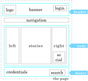
A basic one looks like this:[[File:Wireframe_0.png|thumb|Basic: header, body, footer]] | A basic one looks like this:[[File:Wireframe_0.png|thumb|Basic: header, body, footer]] | ||
| − | [[File:wframe_0.png| | + | [[File:wframe_0.png|none]] |
Most geekLog pages do have this look-and-feel and the graphic is obvious and simple. Next steps are to refine the rectangles into more detail that reflects the content and functions we want to present. we have the option to replace rectangles, OR , add rectangles inside them and keep the surrounding rectangle for clarity. | Most geekLog pages do have this look-and-feel and the graphic is obvious and simple. Next steps are to refine the rectangles into more detail that reflects the content and functions we want to present. we have the option to replace rectangles, OR , add rectangles inside them and keep the surrounding rectangle for clarity. | ||
| + | |||
| + | |||
| + | == Extended == | ||
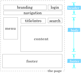
First thing is to drill down the BODY rectangle. [[File:Wireframe_1.png|thumb|Extended: header, body:(menu, application), footer]] | First thing is to drill down the BODY rectangle. [[File:Wireframe_1.png|thumb|Extended: header, body:(menu, application), footer]] | ||
| Line 10: | Line 17: | ||
[[File:wframe_1.png|center]] | [[File:wframe_1.png|center]] | ||
| − | + | == Advanced == | |
| − | [[File:Wireframe_2.png|thumb|Advanced: header:(branding, secure, globalNav), body:(secondaryNav, title, support), footer]] | + | |
| + | [[File:Wireframe_2.png|thumb|Advanced: header:(branding, secure, globalNav), body:(secondaryNav, content:(title, support), application), footer]] | ||
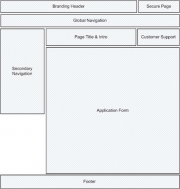
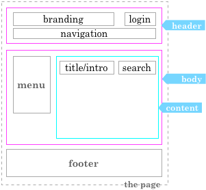
Now add some functionality. As an example the HEADER is designed in detail, we forget about BODY and replace it by a MENU and some CONTENT is added with embedded rectangles for a STORY and a SEARCH box. | Now add some functionality. As an example the HEADER is designed in detail, we forget about BODY and replace it by a MENU and some CONTENT is added with embedded rectangles for a STORY and a SEARCH box. | ||
| Line 18: | Line 26: | ||
[[File:wframe_2a.png|center]] | [[File:wframe_2a.png|center]] | ||
| − | + | == GeekLog == | |
[[File:wframe_3b.png|right]] | [[File:wframe_3b.png|right]] | ||
Latest revision as of 11:04, 29 September 2014
Contents
Introduction
'Wireframes' is the name for a simple technique to streamline the development. The technique basically assumes that your webpages are built from rectangles (see the box model) and it helps to create order in the development chaos by facilitating a visual approach. See also Wikipedia, review a beginners guide or view some general examples
Basic
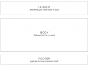
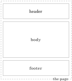
A basic one looks like this:Most geekLog pages do have this look-and-feel and the graphic is obvious and simple. Next steps are to refine the rectangles into more detail that reflects the content and functions we want to present. we have the option to replace rectangles, OR , add rectangles inside them and keep the surrounding rectangle for clarity.
Extended
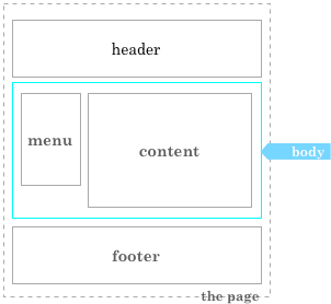
First thing is to drill down the BODY rectangle.Below is still a simple layout, but note that now the position of the rectangles is inherently defined, though is relative to each other.
Advanced
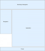
Now add some functionality. As an example the HEADER is designed in detail, we forget about BODY and replace it by a MENU and some CONTENT is added with embedded rectangles for a STORY and a SEARCH box.
The example below is stripped from the major rectangles and shows no dependencies.
GeekLog
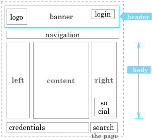
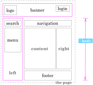
The layouts that geekLog is using can be wireframes also, as is shown to the left and the right. With a clear and implicit layout from top to bottom and from right to left, or just some boxes glued together.
At this very moment the need for a clean design is seen. And some rectangles need specifications for width and height.
Window size is something to think about too.
All these rectangles can be given a proper name or ID and these names must be used in the communications in the development team.
Without such a wireframe, without such visual representation, any comment on the content outlined, any hint etc. will loose its meaning.
